Microeconomic View of International Trade

Here’s a little refresher on the microeconomic view of international trade. For simplicity, we assume perfectly competitive domestic and international markets. That means domestic consumers can buy as much foreign goods as they want without affecting the world price. Similarly, domestic producers can sell as much as they want in foreign markets without affecting the world price. While not essential to the basic results, these assumptions make the graphs easier to interpret (and draw!).

First, let’s establish the baseline: no trade. The graph below shows the market for some product in a closed economy. Supply and demand refresher: price is on the vertical axis and quantity on the horizontal. The demand curve shows the relationship between price and the quantity consumers will buy (with other factors held constant). That is, the demand curve shows how much people are “willing and able” to pay for the product at each price. It’s downward sloping because of the law of demand: the more things cost, the less people are willing to buy it.

Supply Demand 1

The supply curve shows how much producers are will to sell at various prices. It is upward sloping because marginal costs increase in the short-run (fixed assets) as output increases. The place where supply and demand intersect is the market equilibrium. The price, p*, is the “market clearing price” because, at that price, consumers are willing and able to buy exactly the amount suppliers make available.

In a competitive market, this equilibrium maximizes total social benefit, as measured by the sum of consumer and producer surpluses. Each surplus is simply a measure of the gains from each individual transaction. For example, the difference between what a consumer is willing to pay (i.e., demand) and what he actually pays (i.e., price). Note that while this result is efficient (makes the largest total social benefit), there are still people who are unhappy with the arrangement. There are consumers who are not willing (or able) to purchase the good at price p*. Similarly, there are sellers whose costs are too high to stay in business when prices are at p*.

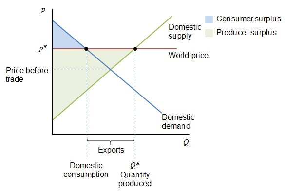
Now, if we make this an open economy, and the domestic suppliers have a comparative advantage over foreign suppliers (i.e., produce at lower opportunity cost), the world price will exceed the domestic price, as shown below. In this case, those unhappy producers in the closed economy might be able to sell their wares at the higher global price. The catch is, producers will divert production to satisfy world demand at the higher price, and domestic consumers are hurt. They end up consuming less product at a higher price. However, the total amount of surplus increases overall.

Supply Demand Export

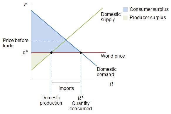
Suppose instead that the world price is lower than the domestic price was in the closed economy. In this case, consumers are better off because they can consume more of the product and at a lower price. The domestic producers, however, have to compete at that lower price, so some of them will not be able to survive. In this scenario, the consumers benefit at the expense of producers, but as before, the total amount of surplus increases compared to the closed economy.

Supply Demand Import

The difference between these two scenarios is the allocation of the “pain.” In the first case (exports), the affected consumers are very numerous, and their individual expense is probably negligible (a slightly higher price paid by each of them). The producers, however, are smaller in number, so the gains are more concentrated. Similarly, in the import scenario, there are many consumers whose individual benefit is only a slightly lower price. The producers, being fewer in number, feel a bigger impact from competition. (Imagine closing a factory versus saving a couple dollars at the store.) The producers have more incentive to lobby the government for assistance in both scenarios. That basically explains why governments frequently subsidize their exporters and impose trade barriers to protect their importers. These barriers include tariffs (taxes) and quotas (limits on the amount of imports). Let’s look at a tariff.

The graph below shows the same import market with a tariff added. Since the tariff is simply a tax per unit, the after-tax world supply curve effectively moves up by the amount of the tariff. The result is an increase in output for domestic producers and a decrease in consumption by consumers, who also pay a higher price. The government also benefits from the tax revenue collected. Notice the total surplus in this scenario is reduced. This frequently occurs whenever government policies interfere in an efficient market. The loss of surplus is called “dead weight loss.” It’s like trying to transfer water with a bucket; some of it always splashes out and is wasted.

Supply Demand Import Tariff

There are many arguments producers (and politicians) use to justify trade protections. These include domestic jobs, infant industry protection, national security, and unfair competition by foreign companies. Regardless of the reason, the actual impact of protection exceeds our simple analysis because each country does not act in isolation. Once a nation imposes trade protections, the other nations impose their own protections in retaliation. The benefits a government seeks for its domestic industries, therefore, will hurt its export industries as well as its consumers. More importantly, these protections interfere in the free market’s ability to use prices as signals to guide the efficient allocation of resources.

If you want more information without getting into differential equations, pick up any introductory macroeconomics textbook. I’ve taught with N. Gregory Mankiw’s Essentials of Economics, Robert Frank and Ben Bernanke’s Principles of Economics, and Thomas Sowell’s Basic Economics. Mankiw does the best job of covering trade.


No Excuse Not To Save

Search any finance site and you’re bound to find an article on retirement savings and the importance of starting early. It’s not exactly earth-shattering news, but I read them anyway out of morbid curiosity about the comments. Today’s entertainment (and disappointment) came from a recent Yahoo! Finance story about retirement mistakes to avoid:

  • Not Starting Early
  • Not having a Roth IRA
  • Raiding your retirement account
  • Cashing out your 401(k)

Good advice, but with any article I see on savings, there’s always some comment about how hard it is or “easy for you to say” from someone claiming difficult life circumstances or just flat out hatred for banks or Wall Street. Here are some of the comments from this story (typos and all):

  • Just making financial institutions,FATTER!
  • With rent in Toronto what it is, your dollar earned at Starbucks can only carry you so far. Share your dwelling with 14 other millenials, and you MIGHT have something to spend on your retirement day.
  • DO NOT believe any of these financial advisor’s #$%$. Yes, they have good advice but it doesn’t apply to most of us.
  • Likely the biggest mistake is thinking you’ll be able to retire.
  • Kinda hard to give a damn about retirement when you’re just trying to keep the lights on another week.
  • Unrealistic for the vast majority of young people to start saving at age 25. More like 35 once they establish a career. Every time I read an article that says start saving at 25 I know they are out of touch.

It’s sad that there are so many people who don’t get it. The point of starting early is to benefit from compounding interest. You can actually save less and have more at retirement if you start early. See the example from Chapter 6 of Basic Personal Finance.

The key is being disciplined with your spending. Create a budget to identify frivolous spending and get it under control. Here’s an example from the comments that I wished I had used in the book: “Don’t spend more on coffee every day than you save for retirement every month.”

If you can’t afford to save 10% of your income, you’re living beyond your means. Rather than making excuses for why you can’t save, use your energy thinking of ways that you can save.

Incentives Matter… Even in Education

A couple weeks ago, there was an article in the Gainesville Sun that said the average out-of-pocket expenses for tuition and fees for a bachelor’s degree from the University of Florida was only $10,660. That same day, I happened to be looking at the school’s website and something caught my eye: The school received $724 million in research grants last year. My inner economist quickly realized the incentive problem that leads to poor quality teaching at UF (at least from the perspective of the students I tutor). I did some quick math and confirmed that incentives do in fact matter, even at public universities. Follow the money…

Assuming a four year program, the $10,660 figure translates into $2,665 per year per student (out-of-pocket). The school has 35,043 undergrad students. That means the school collects about $93M per year directly from these students. In other words, they get over 7.5 times more money from research grants than they do from students. (At my Air Force retirement, when asked if I was planning to teach at UF, I joked: “They don’t teach at UF, they write grant proposals.” At the time I didn’t realize how true that statement was.)

Let’s be fair: the school collects more for students than just their out-of-pocket expenses. According to the school’s own numbers, tuition and fees come to $6,380 per year ($22,278 for out-of-state students, who comprise 3% of students). That means the school collects $247M for students (assuming someone else pays the difference). That still makes research grants almost 3 times more than money from students.

So what happens at a school that’s not focused on students? It doesn’t hurt their reputation. UF is ranked #14 for best public colleges by U.S. News & World Report. Part of their formula relies on the student-faculty ratio, which they say is 21:1. (Other sites say the number is 20:1.) A lower number is supposed to imply a student focus because they’re more likely to get more personalized attention from professors. But at a research school, faculty who focus on research may only step into a classroom to lecture to one very large section of students, so the figure could be misleading. A better measure would be actual class sizes. Trying to find the average class size is difficult, but we know what a good standard should be from UF: Their website says “the honors classes are limited to 25 or fewer students.”

What’s the average class size for regular classes at UF? Collegedata.com says “full-time faculty teaching undergraduates” and “regular class size” are not reported. That doesn’t sound like a school that wants to brag about student focus. Collegeconfidential.com has students talking about 300+ and 500+ student classes (a number confirmed anecdotally from students I’ve tutored). Surprisingly, Startclass.com says “Small class sizes (mostly 10-19 students).” UF’s own website says this: “Class size averages depend, of course, on the program, the college and the level of the student. Instructional Faculty & Class Size can be found on the Office of Institutional Research site.”

Visiting the link to Office of Institutional Planning and Research shows class sizes from Fall 2012:

UF Class Size

That’s where Startclass.com got its number, but while 10-19 is the median size, it’s less than 30% of the total. Realize that classes with 30+ students make up 32.6%, and over a fifth of the classes (23%) have over 40 students. If you remove those honors classes and majors classes, the average class size for freshmen and sophomores will be even worse. Like I said, not student focused.

I don’t mean to imply there aren’t good teachers at UF, or that all professors do not care about their students. I’m just pointing out that it appears quality education (at least as measured by average class size) is not the focus at the institutional level. The money shows why.

You could argue another reason for the lack of student focus is that students pay less than 40% of the cost (and even that is likely paid by parents). That brings up the same third-party payer issues we have in healthcare. That’s a blog post for another time.

Social Security: Take It While You Can!

Today’s post is for the chronologically gifted (i.e., those eligible for Social Security). The conclusion from a Sean Williams article on The Motley Fool: take your benefits while you can. The only way holding off on social security benefits pays off is if you expect to live beyond 85. It’s a morbid thought, thinking about when you’ll die, but that’s the fact of retirement planning. You have to make sure there’s enough money to support yourself while you are alive.

Williams used the average monthly Social Security payout for retirees ($1,363.66) and looked at lifetime payouts for various retirement ages (62 to 70). Assuming 2% cost of living adjustments, the 62-year-old retiree’s payouts exceeds all others until age 85. So if you’re eligible for Social Security, you may as well take it now. You’ll get lower monthly payments but greater total benefits.

For the rest of us, realize how little Social Security actually pays: $1,363.66 x 12 = $16,363.92. That’s not much to live on, even if you have no debt. You need to start planning now to make sure you grow a retirement nest egg that will support the quality of life you want in the future. Also read Chapter 6 of Basic Personal Finance and you’ll realize you’re Social Security benefits will be less than current retirees (if you get any at all).

Median Savings (Again)

CNBC is milking the Economic Policy Institute report from March 2016 to report “news” over a year later. This time it’s average and median retirement savings for people in their 50s.

Age Average Median
50-55 $124,831 $8,000
56-61 $163,577 $17,000

Note how low those medians are. I used the age 32-37 median (< $500!) on the back cover of Basic Personal Finance. These numbers show that over half the population is not prepared to support themselves in retirement. Don’t let that happen to you. The key is to plan ahead and establish financial discipline early in your life to save for the future. That’s rule #1 in Basic Personal Finance: Pay yourself first!

The original report is here. The table below is their summary chart that was featured in the CNBC story.

5560