MMT proponents are why you can’t afford a house

One of the basic principles of economics is that there is no such thing as a free lunch. Nothing is truly free, because even if something has no monetary cost, the time it takes to acquire or consume the thing is time you can’t spending doing something else.

People seduced by modern monetary theory (MMT) over the last decade and a half should be realizing that their promised free lunch is not truly free. MMT basically says that governments can print all the money they want without having any negative consequences on the economy. The rapid increase in inflation and mortgage rates over the last couple of years demonstrates that there is a consequence for recklessly extravagant government spending.

Prior to the blissful ignorance of MMT proponents, economists frequently talked about the crowding out effect and monetary devaluation (i.e., inflation) of excessive government debt. When the government has to borrow money to cover a deficit, the extra demand for financial resources drives up the price of money (i.e., interest rates) for everyone. For a long time, international investors were willing to buy up a large share of the debt issued by the Federal Reserve, so rates did not rise as would be expected.

This emboldened the MMT proponents whose advice encouraged free-spending politicians looking to buy favor from the electorate and their campaign donors. Unfortunately, the massive increase in spending during the COVID response coincided with reduced debt purchases by foreign investors and bought MMT face-to-face with reality. As philosopher Dallas Willard wrote, “We can think of reality as what you run into when you are wrong.”

How much did spending increase? According to the Economic Report of the President (Table B-46), over the last decade (2015-2024) government revenue increased 2.8% (the 2023 and 2024 figures are estimates). Over that same period government spending increased 24%. To put that in perspective, over the decade before that (2005-2015), government revenue increased 3.6% compared to spending increasing 4.7%.

Looking at the foreign share of the debt (Table B-52), from the beginning of 2020 to the end of 2022, the federal debt increased 32.6% ($7.7 trillion), but the foreign ownership of the debt only increased 5.2% ($365B). The foreign share of the debt dropped from 29% to 23%. That means the new borrowing was done domestically, so the impact on the economy is no longer covered up by foreign investors.

The cost comes from both increased prices and increased interest rates. Using Consumer Price Index figures from the Minneapolis Fed, the last five years of data (2019-2023) shows an increase of 19%, over triple the previous five-year period: CPI grew 6.1% from 2014-2018. If you buy your own groceries, you’ll realize that some prices increased even more. Here are a few I tracked between 2020 and 2023:

  • Distilled water – up 22%
  • Whole milk – up 42%
  • Greek yogurt – up 49%
  • Canned cat food – up 37%

The chart below shows the 30-year and 15-year fixed rate mortgage rates over the last ten years (Source: FreddieMac). The rates were down to 2.66% in December 24, 2020, likely due to the lockdowns in response to COVID. Since then, they’ve shot up to 7.79% on October 26, 2023 (the last data point on the graph). Bankrate reported that the average rate for 30-year fixed mortgages was 8.01% during the final week of October. (There is some difference in the data as FreddieMac numbers are “based on actual applications from lenders across the country that are submitted to Freddie Mac” and Bankrate’s numbers are based on a “weekly national survey of large lenders.”)

What does this mean for you? More expensive homes that cost more to finance.

The 2019 edition of my book used an example of a $200,000 home, financed at 4% after a 20% down payment. That results in a payment of $763.86 and a total interest of $114,991 paid over the 30-year term. For the 2023 edition, I used a $300,000 home, financed at 7% with 20% down. The monthly payment doubled ($1,596.73) and the total interest paid nearly tripled ($334,821). That was written while rates were still climbing.

That same $300,000 home financed at 8% instead of 7% will have a monthly payment that is 10% more ($165) and cost nearly 18% more ($60,000) in total interest over the life of the loan.

Things would be even worse if you buy an average home. I used the $300K figure assuming a smaller, entry-level home. According to the St Louis Fed, the average sale price of houses sold in the U.S. rose from $375K in Q2 2020 to $552K in Q4 2022. That’s a 47% increase, well above inflation based on CPI.

Thanks to politicians using MMT to justify their spending habits, 2023 is a terrible time to be a home buyer.

Bubbling Assets Are Not Good Investments

A recent column by Gail MarksJarvis in the Chicago Tribune warned that “Investors Should Be Wary of Bitcoin.” She warns that while Bitcoin has seen 358% gain this year, it’s probably approaching the peak of its asset bubble, and newer investors will get caught holding the hot potato when the bubble pops. They’ll be just like the losers from the 2008 housing crash, the 2000 tech bubble crash, and the Nikkei crash in the 1980s.

I’d like to add a separate warning that also applies to many other alternative investments, like gold or real estate. Often, the rationale for these investments is that they have “real” value or they’re more stable because they don’t rely on the financial system. Really? NOTHING has inherent value unless it can feed you, clothe you, or provide shelter for you. Everything else only has value because people agree on its value.

Take gold, for example. It’s a nice, non-corroding, malleable metal that’s also a good conductor of electricity. What good is it when the economy crashes and the zombie apocalypse starts? You’ll have hunks of metal. That won’t help you grow food or even buy food if there’s none available. It only has value if you find people willing to accept it in exchange for whatever they’re willing to sell.

One of the arguments people use for Bitcoin is that it’s independent of governments and central banks, so it’s more stable than fiat currencies and will survive the pending banking collapse from all the debt problems. Sorry, but nothing that grows at 300% per year is stable. Again, consider the worst case zombie-apocalypse scenario: if the “system” goes and there’s no power generation, what good is cryptocurrency when no one can use a computer to verify you have any?

If you’re really concerned about doomsday economic scenarios, build up a stockpile of food, water, and essential living supplies. If you’re looking for solid financial investments, jumping on an asset bubble is not a long-term strategy.

Why Productivity Matters

Bloomberg’s Shift: The Commission on Work, Workers, and Technology report tried to address the problems workers face with technological innovation. It did, however, praise technological advances because increased productivity is the only real way to advance our quality of life. Here’s why:

Consider the most basic model of a firm selling a single product in a competitive market. That means the firm can sell as much as it can produce at the market price, p. The firm’s inputs are labor, L, and capital, K. For simplicity, we’ll assume capital is fixed in the short-run. (It doesn’t affect the result.) The firm’s objective is to maximize profit, so it will produce efficiently. That means it will produce on its production function, f(L, K), a function that defines maximum output for given levels of inputs, L and K.

The firm’s objective is to maximize profit which equals revenue minus cost. Price times output (production function) is total revenue. Costs are wage (w) times labor and rental cost of capital (r) times capital. To keep the math simple, assume competitive input markets as well, so w and r are constant. The firm’s objective function is

MaxProfit

This is a simple, unconstrained optimization problem with a single decision variable, L. (The bar over K is to denote that capital is constant.) To solve the problem, take the derivative with respect to the single decision variable (L) and set it equal to zero:

dProfitdLabor

The result: pMPL = w, where MPL is the marginal product of labor (the derivative of the production function with respect to labor).

So, if we define our quality of life based on our income (wage), we want to increase w. That can only be done by increasing p or MPL. The former will raise wage, but not effectively increase real purchasing power because the increased wage will be offset by the higher price. Increasing MPL, however, will increase wage and allow workers to purchase more product (i.e., higher quality of life).

Note that this analysis also explains why you can’t simply mandate a higher wage. Product prices will rise to effectively negate the wage increase. The only real way to advance our quality of life (as mentioned in the Shift report) is to increase productivity.


10-Year Forecasts are Fairy Tales

The Wall Street Journal just had a great article on the pathetic job the Congressional Budget Office (CBO) has done with predicting costs and coverage from the Affordable Care Act. It’s about time someone points out the idiocy of these projections from Washington (not just the CBO). If you’ve had any statistics classes, you know the standard error for a prediction gets bigger the further away it is from your data. For a time-series model, the error as little as three periods into the future is so big that any predictions are practically meaningless.

I’ve never understood why we always get 10-year forecasts from every agency in Washington. I suspect the reason can be summed up by National Security Advisor Jeffrey Pelt in The Hunt for Red October: “I’m a politician, which means I’m a cheat and a liar, and when I’m not kissing babies I’m stealing their lollipops.” This raises the question: do lollipop makers take election years into account when forecasting future sales?

Anytime you see “10-year forecast,” you can replace that with “Once upon a time,” and you’ll be better prepared for what comes next.

Trade Protections Beget Trade Wars… We All Lose

I’m trying to keep politics out of the blog, but it appears the talking heads on TV and Capitol Hill don’t understand basic economics. They’re spouting a lot of hot air about trade and tariffs, things that anyone who stayed awake in Econ 101 would know are incorrect and/or harmful.

Sadly, many classes these days only teach a macroeconomic perspective of international trade, focusing mainly on exchange rates and current account balances. But I’m a micro guy, and from my perspective, all that stuff misses the point of trade. Trade is between individuals, not nations. Both parties come together to make a mutually beneficial transaction… both of them are better off afterward. There is no difference between trading with your neighbor, trading with a guy in another city, or trading with a guy in another state or another country. (Read about the microeconomic view of international trade.)

Don’t get me started on the trade deficit. Trade imbalances are purely academic. There is an exchange: they give us goods, we give them money… worthless paper if they don’t buy something back from us or trade that paper to someone else. Everyone I know has a HUGE trade deficit with their local grocery store. That doesn’t mean we’re somehow in danger of being taken over by the store or that we won’t be able to continue buying groceries.

The only thing trade protection does is harm consumers. Worse, as soon as other countries enact their own protections, the protectionism also harms the original nation’s exporters. You don’t need to look very far. Just last week, Canada imposed restrictions on U.S. dairy products. The U.S. is now talking about a tariff on Canadian lumber.

It only takes about 15 minutes to teach kids the benefits of trade with bags of candy. Why is it so hard for politicians to figure it out? While they’re busy playing to populist sentiments, they’re ignoring the lessons of economics and history (look up the Smoot Hawley Tariff).

Microeconomic View of International Trade

Here’s a little refresher on the microeconomic view of international trade. For simplicity, we assume perfectly competitive domestic and international markets. That means domestic consumers can buy as much foreign goods as they want without affecting the world price. Similarly, domestic producers can sell as much as they want in foreign markets without affecting the world price. While not essential to the basic results, these assumptions make the graphs easier to interpret (and draw!).

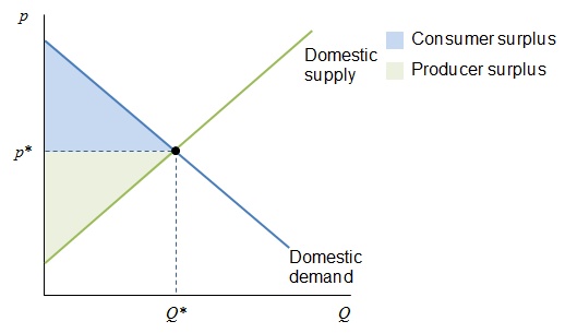
First, let’s establish the baseline: no trade. The graph below shows the market for some product in a closed economy. Supply and demand refresher: price is on the vertical axis and quantity on the horizontal. The demand curve shows the relationship between price and the quantity consumers will buy (with other factors held constant). That is, the demand curve shows how much people are “willing and able” to pay for the product at each price. It’s downward sloping because of the law of demand: the more things cost, the less people are willing to buy it.

Supply Demand 1

The supply curve shows how much producers are will to sell at various prices. It is upward sloping because marginal costs increase in the short-run (fixed assets) as output increases. The place where supply and demand intersect is the market equilibrium. The price, p*, is the “market clearing price” because, at that price, consumers are willing and able to buy exactly the amount suppliers make available.

In a competitive market, this equilibrium maximizes total social benefit, as measured by the sum of consumer and producer surpluses. Each surplus is simply a measure of the gains from each individual transaction. For example, the difference between what a consumer is willing to pay (i.e., demand) and what he actually pays (i.e., price). Note that while this result is efficient (makes the largest total social benefit), there are still people who are unhappy with the arrangement. There are consumers who are not willing (or able) to purchase the good at price p*. Similarly, there are sellers whose costs are too high to stay in business when prices are at p*.

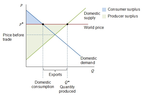
Now, if we make this an open economy, and the domestic suppliers have a comparative advantage over foreign suppliers (i.e., produce at lower opportunity cost), the world price will exceed the domestic price, as shown below. In this case, those unhappy producers in the closed economy might be able to sell their wares at the higher global price. The catch is, producers will divert production to satisfy world demand at the higher price, and domestic consumers are hurt. They end up consuming less product at a higher price. However, the total amount of surplus increases overall.

Supply Demand Export

Suppose instead that the world price is lower than the domestic price was in the closed economy. In this case, consumers are better off because they can consume more of the product and at a lower price. The domestic producers, however, have to compete at that lower price, so some of them will not be able to survive. In this scenario, the consumers benefit at the expense of producers, but as before, the total amount of surplus increases compared to the closed economy.

Supply Demand Import

The difference between these two scenarios is the allocation of the “pain.” In the first case (exports), the affected consumers are very numerous, and their individual expense is probably negligible (a slightly higher price paid by each of them). The producers, however, are smaller in number, so the gains are more concentrated. Similarly, in the import scenario, there are many consumers whose individual benefit is only a slightly lower price. The producers, being fewer in number, feel a bigger impact from competition. (Imagine closing a factory versus saving a couple dollars at the store.) The producers have more incentive to lobby the government for assistance in both scenarios. That basically explains why governments frequently subsidize their exporters and impose trade barriers to protect their importers. These barriers include tariffs (taxes) and quotas (limits on the amount of imports). Let’s look at a tariff.

The graph below shows the same import market with a tariff added. Since the tariff is simply a tax per unit, the after-tax world supply curve effectively moves up by the amount of the tariff. The result is an increase in output for domestic producers and a decrease in consumption by consumers, who also pay a higher price. The government also benefits from the tax revenue collected. Notice the total surplus in this scenario is reduced. This frequently occurs whenever government policies interfere in an efficient market. The loss of surplus is called “dead weight loss.” It’s like trying to transfer water with a bucket; some of it always splashes out and is wasted.

Supply Demand Import Tariff

There are many arguments producers (and politicians) use to justify trade protections. These include domestic jobs, infant industry protection, national security, and unfair competition by foreign companies. Regardless of the reason, the actual impact of protection exceeds our simple analysis because each country does not act in isolation. Once a nation imposes trade protections, the other nations impose their own protections in retaliation. The benefits a government seeks for its domestic industries, therefore, will hurt its export industries as well as its consumers. More importantly, these protections interfere in the free market’s ability to use prices as signals to guide the efficient allocation of resources.

If you want more information without getting into differential equations, pick up any introductory macroeconomics textbook. I’ve taught with N. Gregory Mankiw’s Essentials of Economics, Robert Frank and Ben Bernanke’s Principles of Economics, and Thomas Sowell’s Basic Economics. Mankiw does the best job of covering trade.